9 Best Website Layout Examples and Ideas for Web Design in 2018
A compilation of 9 of the best website layout examples and ideas in 2018. These websites are also great places to get free web design templates.
It is true what they say about having only one chance to make a good first impression. Good website designs can take one’s breath away at first sight. That’s why homepage design matters a lot. And when it comes to designing websites, getting the layout perfectly is imperative.
To give you some inspiration and help you along with your next project, the Mockplus team has gathered 9 of the best website layout examples in 2018. You will get the most creative website layout ideas from them.
1. Diker Bau Website
Website layout idea: Featured image to display the brand identity
Diker is a Group of Construction and Architecture+Planning companies based in Berlin, Germany. The designer outlined the major characteristics and attributes of the brand identity. These were used as the basis for the overall website structure and architecture. Modern coding and testing techniques were used to ensure the usability of the website.
The design is not littered with excess elements, thus directing the user’s attention entirely toward the product.
Images provide an opportunity to create an emotional connection with visitors — a big, bold photograph or illustration of an object makes a strong statement and creates a stunning first impression. This layout is great when you need to demonstrate only one product/service and focus a user’s attention on it. If you want to design a site that can sell a product fast, then use this type of layout.
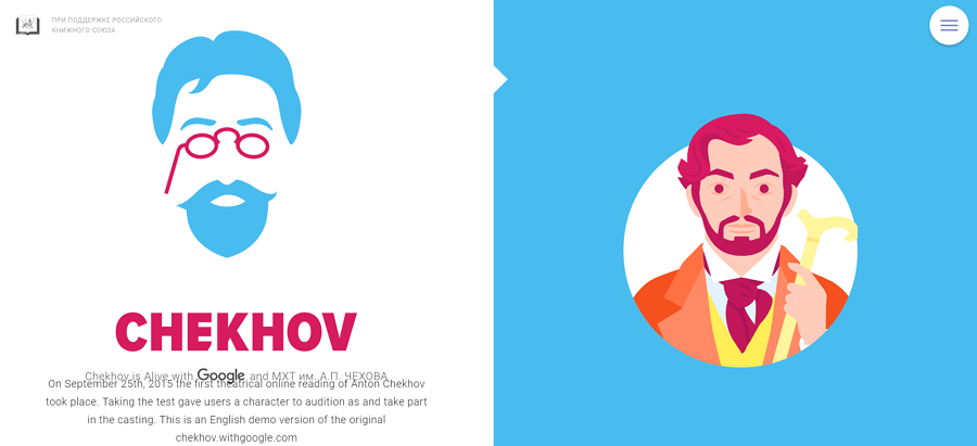
2. Chekhov
Website layout idea: Split screen layout
Chekhov uses a split screen layout, which offers two main pieces of content of equal importance simultaneously. By putting two items side by side, the designer creates contrast, thus attracting more attention. The combination of animation and color changes creates a more dynamic experience.
If your site needs to offer two drastically different variations of the user journey, then use the split screen layout. But do avoid using too much content in split sections. Split screen designs do not expand as well as content grows, so it’s better to avoid this type of layout if you need to provide a lot of textual or visual information in split sections.
Visit site: https://chekhov.withgoogle.com/alive#home
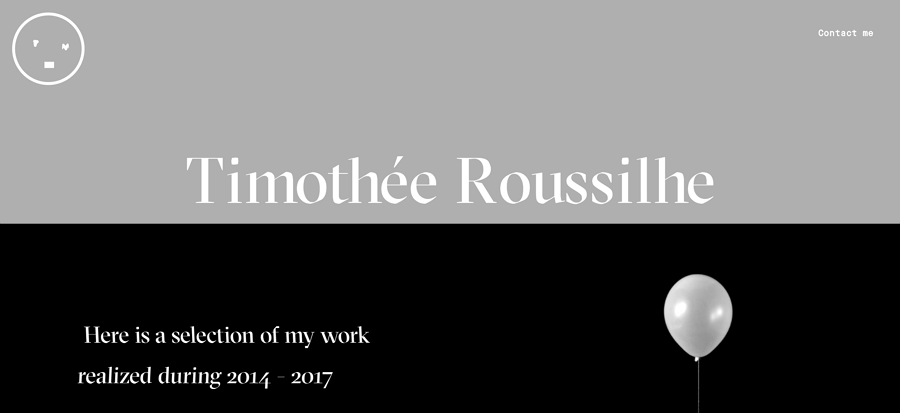
3. Timothee Roussilhe
Website layout idea: Parallax scrolling effect
Time thee Roussilhe is the resume website of designer Timothee Roussilhe. It’s simple yet creative. He adds a parallax effect to provide an impressive experience. As you scroll down, there are boxes moving in and out. What’s amazing is how all the boxes take advantages of the parallax effect; you feel like you are watching a movie while browsing the site.
If you want to design a website with cool factors, then use the parallax effect. But remember to keep the layout simple and use a clean color scheme to avoid a messy design.
Visit site: http://timroussilhe.com/
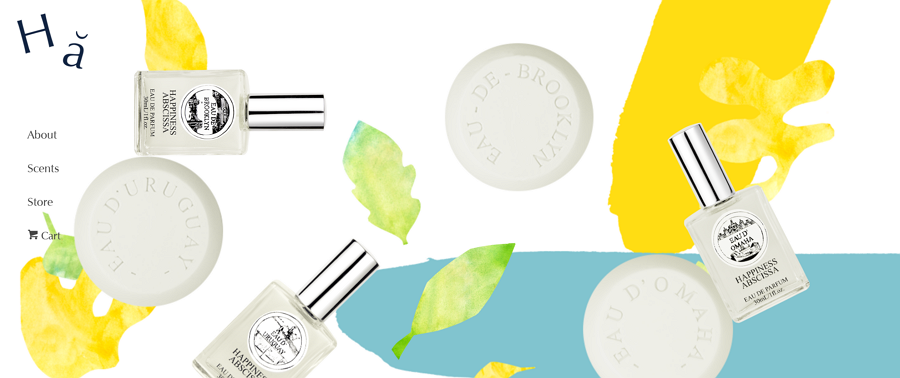
4. Happiness Abscissa
Website layout idea: Fixed sidebar navigation
Happiness Abscissa uses a fixed sidebar navigation to display the whole layout. The main menu is the critical element in user navigation. It tells the user where they are and where they want to go.
Usually, we see a top-side horizontal navigation, but here, we see a vertical column on the left part as the sidebar. The key is to keep the bar visible and accessible while the rest of page changes as users scroll up and down.
This site also uses a parallax effect. As you scroll down, the layout changes and just displays text accompanied by a single decoration.
If you are building a website that contains only a few navigation options, you might want to consider this layout. It can ensure all the options are in-sight as users go through your page. Also, you can add social media links, contact details, or any other information you want to visitors to find easily on the sidebar.
Visit site: https://www.happinessabscissa.com/
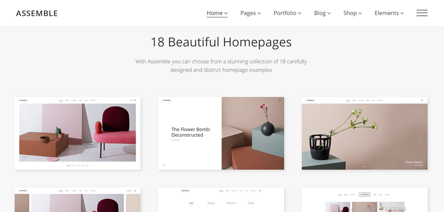
5. Assemble
Website layout idea: A grid of cards
Assemble offers wonderful portfolio projects by using cards in a grid structure. Cards allow you to serve up a heavy dose of clickable information in a digestible manner. It helps visitors find the content they like and provide a way to dive into details by simply clicking or tapping the card.
This layout is also popular in responsive layout design. Grids of cards work excellently with variable elements such as size, spacing, number of columns, and screens — with the ability to display a lot of items with equal hierarchy. So, if you have a content-heavy site, a grid of cards is a perfect choice.
Visit site: http://assemble.edge-themes.com/landing/
6. Medium
Website layout idea: Multi-column layout
Medium is a popular blogging website which presents huge amounts of information to the reader in an easy-to-follow manner. It uses a multi-column grid to create a complex hierarchy and integrates text and illustrations, making it easier for visitors to scan, read, and understand a page quickly. There is a visual rhythm to allow the eye to travel naturally from one block to another.
This layout is similar to a magazine layout, a good choice for publications that have a complex hierarchy with large amounts of content on a page.
There is one thing that makes the design stand out: when you dive into a deeper page, you will see the article page is in the single-column layout. This makes for an effortless read, even for long articles which require you to scroll down.
Visit site: https://medium.com/
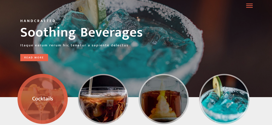
7. Beverages
Website layout idea: Boxes — large header-width box and a few smaller boxes
Beverages has layout with a large header-width box; and a few smaller boxes that each take up a portion of the larger box’s screen real estate. The number of smaller boxes can range from two to five. Each of the boxes can be a link that leads to a larger and more complex page.
This is a versatile layout that can be used for both individual portfolio-like sites and for corporate/e-commerce websites. You can connect boxes to tell a story. The large box can be used to showcase products while the smaller boxes can offer further information on the product.
Visit site: https://p.w3layouts.com/demos_new/template_demo/07-03-2018/beverages-demo_Free/883271017/web/index.html
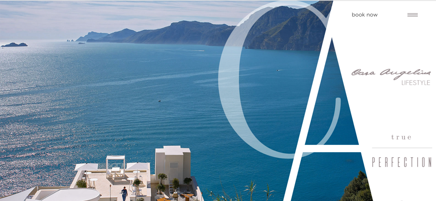
8. Casangelina
Website layout idea: Asymmetrical layout
Hotel Casangelina, one of the top ten cliff hotels in the world, is located on the cliffs of the Amalfi Coast. This website uses an asymmetrical layout, whth a lack of equality between the two parts of the page. Asymmetry is a long-time favorite technique in the art world; and has recently become popular among web designers.
Take note that asymmetry is different from imbalance. The goal of asymmetry is to create a balance when it’s either impossible or undesirable to use equal weight for two sections. Using asymmetry makes it possible to create tension and dynamism. Asymmetry facilitates better scanning behavior by focusing a user’s attention on individual objects (focal points). By changing the width, scale, and color of each asymmetrical piece of content, the designer encourages the visitor to stay visually engaged.
This type of layout can be used when designers want to create interesting and unexpected layouts, while still providing directional emphasis. Appropriately applied, asymmetry can create active space that guides the eye from one element to another, even across emptiness. Consider how Dropbox clearly shows points of focus in the example below.
Make sure your content can be presented in an asymmetrical layout. An asymmetrical layout is not practical for every site. It works best for minimalist layouts.
Add focus with color. Asymmetry is rooted in the idea that an object with more visual weight will draw attention first. You can use elements with high color contrast to add visual weight to specific parts of the design.
Visit site: http://www.casangelina.com/
9. Tinkerwatches
Website layout idea: One big photo with clear CTA
The core element of this layout is one big photo that is used as a background for the page. It’s used to introduce visitors to the site content. This layout has an opportunity to create a strong first impression and encourages user interaction
This layout is great when you want to say less and show more. Since the layout — and the message — revolves around a single image, it is critical that you use the perfect one. Choose your image carefully to avoid sending the wrong message or confusing visitors.
Use videos instead of images to engage visitors. It might be worth using video instead of a photo, especially when you need to demonstrate something in action.
Visit site: https://tinkerwatches.com/
There you have it — the 9 best website layout examples we could find. We hope you’ll pick something up from these examples and apply it to your projects. One last thing — don’t forget to give Mockplus /Mockplus iDoc a go when building your next website. With the wide array of components and icons available, you can easily drag and drop elements to finish your page layout. Good luck and happy creating!
by gift



Comments
Post a Comment